Today is the day. Baseball season is finally here, and before the first pitch of the 2025 season is thrown, I wanted to take a look back on a project that encompasses every game of the previous year.
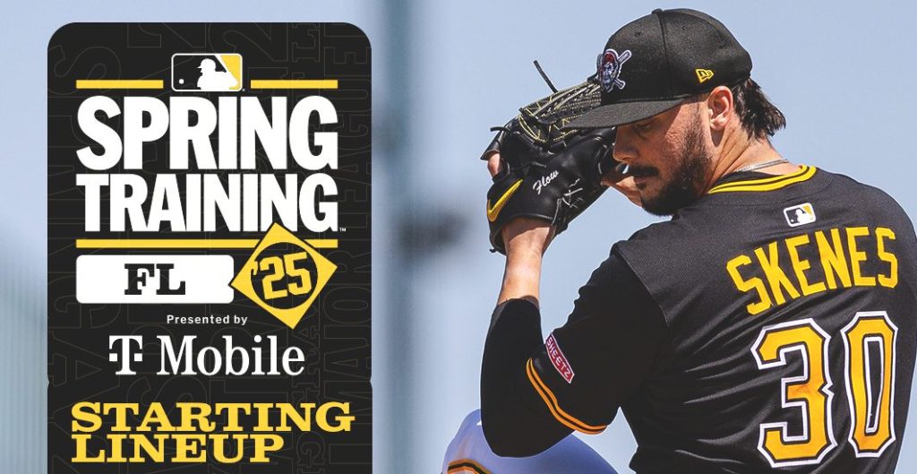
Before every Pittsburgh Pirates game, the team’s social media account on Twitter/X posts a graphic detailing their lineup for that day’s matchup.
Sometimes it’s a pitcher, sometimes it’s a position player, but out of 162 Pirates games last year, 154 of them featured a player on the graphic. But there’s one burning question that lingers in every sports conspiracy theorist’s mind: is there a link between appearing on the graphic and a player’s performance?
Now, as my statistics professor will tell you, correlation does not equal causation.
But, since I’ve completely lost my mind, I went back through each and every Pirates lineup posted on Twitter/X, found out who was on the graphic, looked up their stats for that particular game, and put them all in a massive spreadsheet. The goal was to see if the performance of players on days where they were featured was better or worse than their overall stats.
Hours of research, a few headaches, and an eventual carpal tunnel diagnosis later, I here are my findings.

Subscribe to continue reading
Become a paid subscriber to get access to the rest of this post and other exclusive content.